Syncthing is an open source tool that syncs your data directly between your devices, without needing to go through any third party.
Getting started
When I first started using Syncthing I got rather confused. It is fundamentally a simple product, each of your devices has a unique ID that you use to connect them. Then you create folders and share them with the other devices. Simple.
But some usability issues caused it to be rather unfriendly to new users, there was a lot of information and settings to adjust. I like to call information overload like that "nerd-porn". It consist of showing a lot of information and settings that only nerds like and consider useful.
But for a normal user it is the opposite of useful. It gets in their way and confuses them because it requires them to get intimately familiar with the product before being able to use it. And as a result deters them from using the product, because most people, myself included, simply don't have the time for that.
But in this case I stuck around and found it to be a very powerful product.
Problems
One of the main problems for a new user was knowing where to start. There was no clear indication how you go about connecting to other devices and starting to sync your files. After all most people just want to set it and forget it.
The folders and devices also looked exactly the same. There was no clear differentiation between the two, so you were forced to read, figure it out, and then remember it. This was something I kept forgetting myself so I had to spend some time to remind myself which side was which, especially when I hadn't opened up the UI for a while.
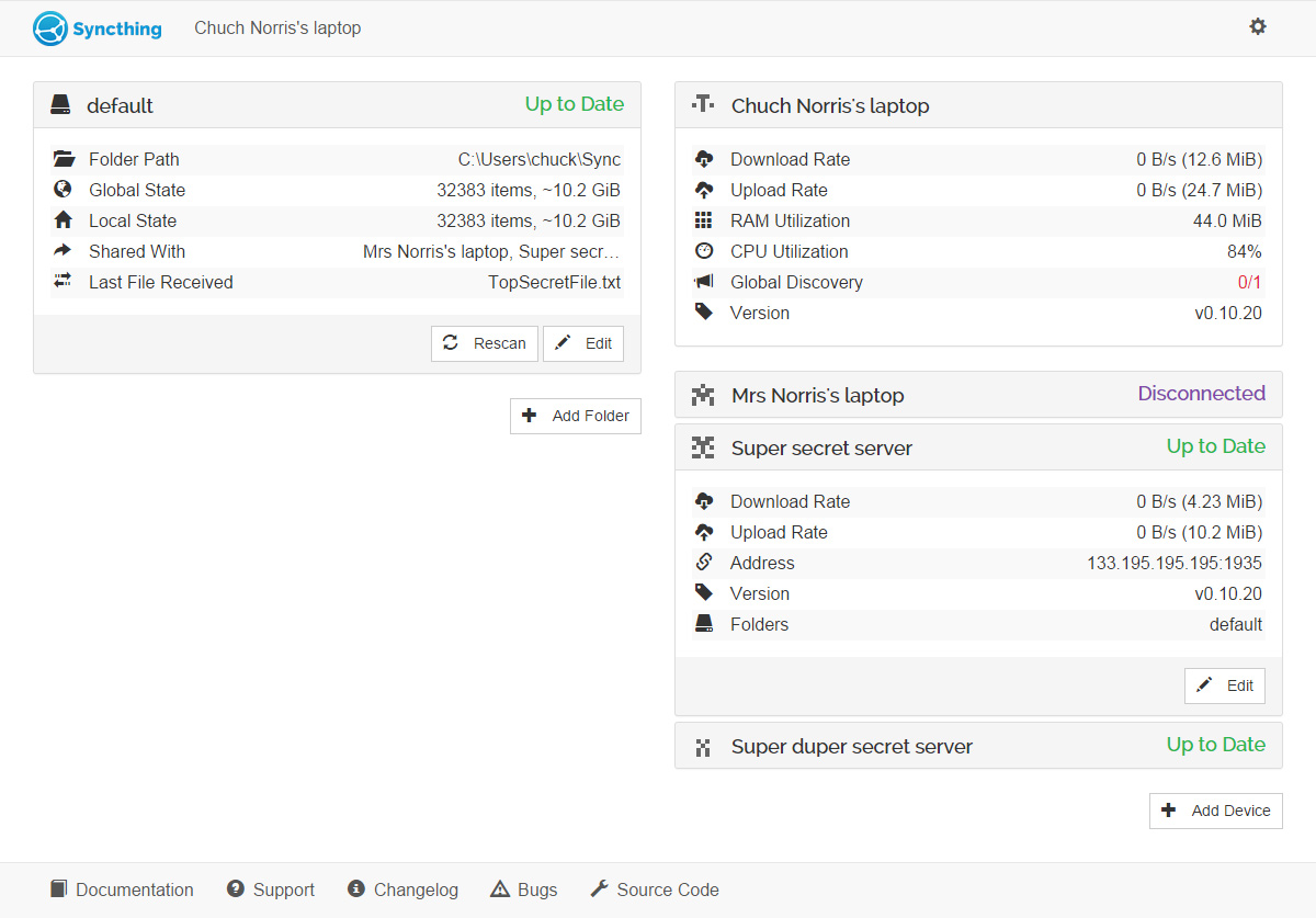
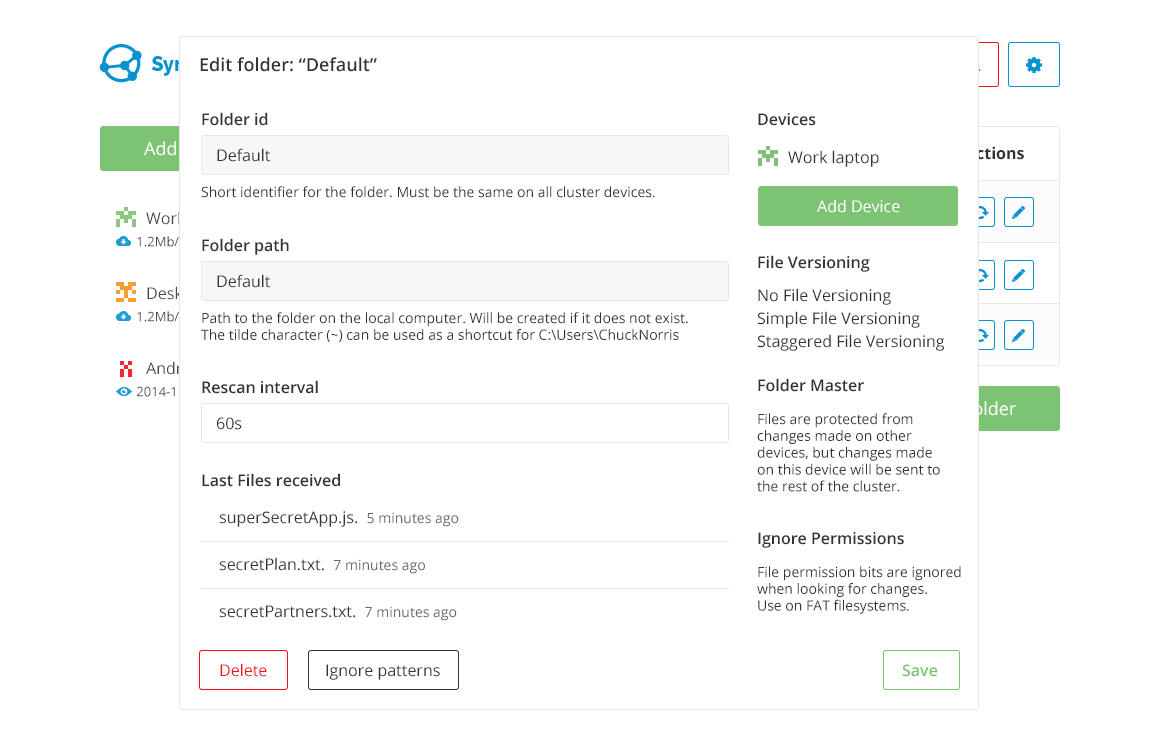
Information overload was another problem like I mentioned earlier. For a normal user all this information is not required when you just want a quick overview of your setup. Extra information like Folder Path, IP address, Version, Last File received, etc.., belongs on its own page after you specifically ask for it.
These problems got me excited to get started in simplifying it all so I headed off and started sketching out some ideas in my notebook.
The initial design
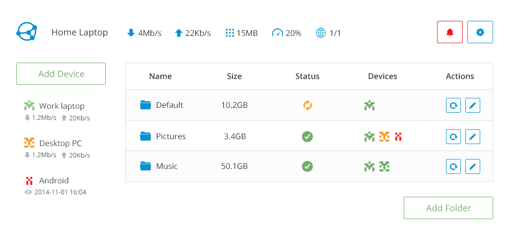
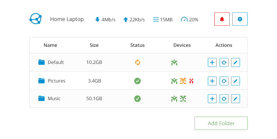
What I came up with looked like this. With information relating to the local device up top, consisting of the name, traffic, RAM and CPU usage (which probably won't be relevant as the product matures) and the number of connected Global Discovery servers, which help you find your other devices. And then right next to it notifications and settings buttons.
Below the area was split up into two parts. On the right side, folders along with useful information. And on the left side connected devices along with only the up and down traffic.
Folders
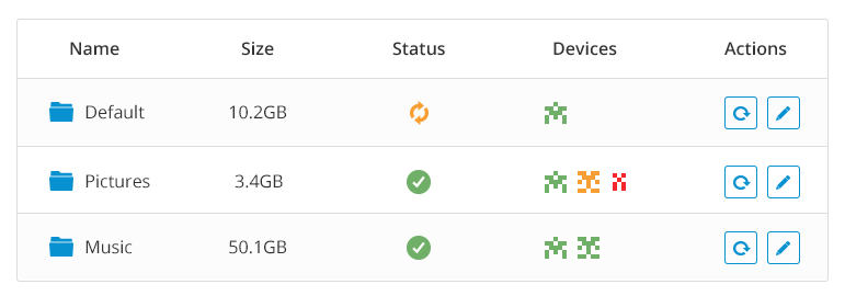
I thought it would make sense to have the folder represent the way you are used to viewing folders. In a kind of a table. Making a clear differentiation between folders and devices. I stripped away a lot of the information relating to each folder. And left only what would help the user get a brief overview of the status. The columns consisted of Name, Size, Status, Devices and Actions
Name
Because folders need names ;)
Size and Status
Before there was a Global state and Local State each followed by the count of items in the folder and the size of the folders. I felt that this was mostly nerd-porn and would confuse most users.
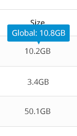
So I reduced it to Size which represents size of the folder on the current device. That allows you to quickly see the size of the folder, and combined with the Status column shows you whether it is in sync with the rest of the devices.
However if you want to see the Global size, you can hover over the size column and a popup will appear with the global size.
Devices
The devices column consist of the identicons that were already in use in the old design. Combined with a color representing the syncing state of that device. Green means that the device is in sync. Yellow means that the device is syncing. And Red means the device is offline. Finally, hovering over the icon reveals the device name.
I never felt fully convinced that this way was the best way to represent devices and I think most likely it will be revisited in the future. The problem is that requiring a hover to see the name is not optimal. But then again in most cases you probably just want to know whether all devices are up to sync or if some of them are syncing. I think getting it out there and letting people use it is the best way to find out if that is the case or not.
Actions
Finally the Actions column has a button to rescan the folder and thus force it to update itself if needed. And an edit button which allows you to make changes to the folder settings.
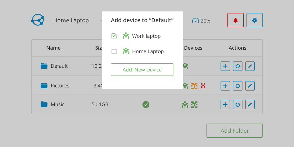
Devices
I wanted the devices to be simple and easy to understand. Just add a device link it with a folder. Initially they were next to the folders with a colored identicon representing their state and up and down traffic displayed right beneath them.
However it then occurred to me that we could simplify it even further since the state is already displayed in the folder section and the traffic is not actually that useful. So I took it a step further and removed the devices section. But added a button to add devices in the Actions column.
More work to be done
There is still a lot of work left to be done. If you want to get involved and help out with the project. Reach out and get started.
Stay tuned for more articles where I will cover working with the community, iterations and development.