
The website ruv.is was in need of a major overhaul. The design was dated, slow, not responsive and people had difficulty finding what they were after. Since we were planning a redesign we decided to do a complete rebuild as well because it was running on Drupal 6 and support would soon end for it. It would give us a chance to reorganize things and make it simpler to maintain for the small team running it.
Research, discovery and design
Once I got acquainted with the company and team I started to get to know our users by using analytics and speaking to them in person. I wanted to find out how they were currently using our site and what problems they were faced with. I found out that majority of our users think of RÚV as their own, since it is publicly owned, and feel very passionately about it. But most of all I found out that they came to ruv.is with a very specific goal in mind, majority of which split into three groups:
- Check the headlines and read the latest news.
- Watch and listen to live streams for our tv and radio channels.
- Watch and listen to recordings from our tv and radio channels in Sarpurinn, our media portal.
It was abundantly clear that if they came with one of these three goals in mind they were usually not very interested in any of the other ones.
It was also clear that we needed to do more to show our users relevant content to keep them engaged the site. Our bounce rate was quite high, around 50%, although this is not unusual for a big news website like this.
But most of all we needed to make the user experience simpler and the interface more consistent. We also needed make it easier to maintain for the small team working on it. This meant creating a style guide and a more modular approach to how it was all built.
The news
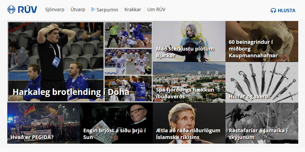
Vast majority of the users come to the front page looking for news. Once there they check a couple of articles and leave. Our user testing told us that people felt that the front page was updated rarely and the same articles lingered there all day. This was something we already suspected so it confirmed our assumptions. The main headlines didn't get much space and the rest of the page only showed a couple of articles from each category of the site, some of which were not actively updated. So even though there were hundreds of articles being published each day it didn't feel like it to the user.
We decided to give the main headlines a lot of space on top with a big collage consisting of 9 of the latest headlines that our news reported wanted to feature.
And below it a continuous scroll of all the latest news, similar to Quartz and Facebook. This would allow the user to see the latest news as soon as they were available and then scroll down as long as they were interested. They could also filter this feed based on their interests. Here is how it looks like.
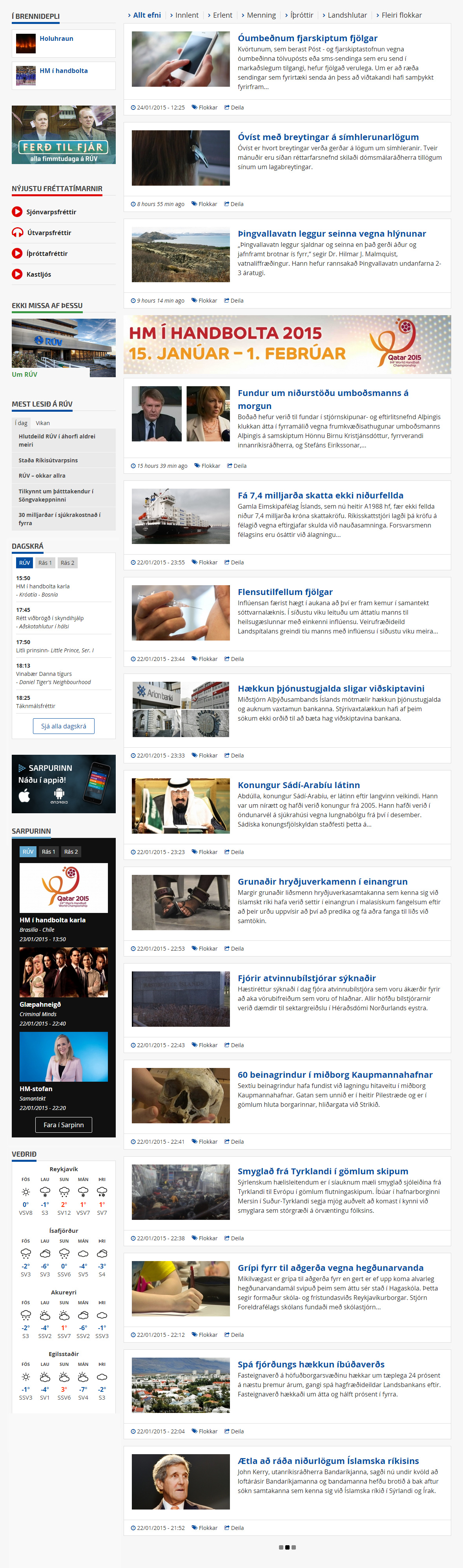
There it is in all its glory with advertisements for our own content, since it is illegal for us to put commercial advertisements on our web, and real content from various stakeholders and departments.
Clicking on any of the articles opens them in place. Allowing the user to quickly read it and then continue down the stream to find other interesting articles.
Sarpurinn, the media portal
For those of you who know the BBC iPlayer, Sarpurinn serves the same purpose. It is a internet tv and radio service that makes the shows previously broadcasted on our tv and radio channels available online, only a few minutes after the shows broadcast ends.
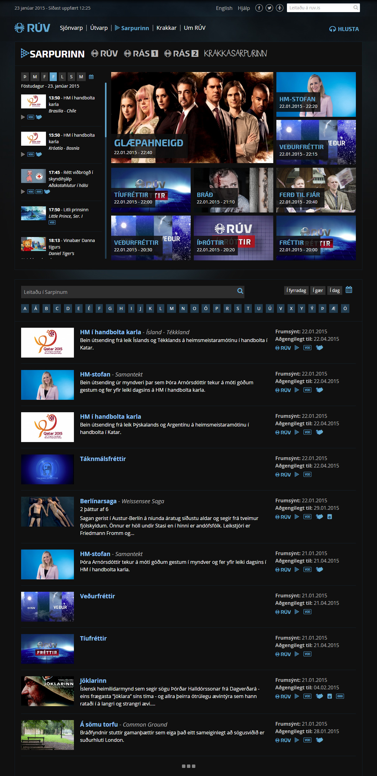
We did a lot of research for it and found out that most users who came to Sarpurinn would end up going out of it to our tv-schedule page and follow the links there back to a specific show in Sarpurinn. This was because they already knew what they wanted to watch, something that had already been on tv earlier that day or the day before. Rarely would they ever just come there to find "something". With this in mind it was clear that we should focus on making the linear tv and radio schedules available right at the start once you arrive in Sarpurinn. So we came up with this:
The linear schedule is the first thing you see on the left, making it easy to find your show according in the schedule without having to leave the front page of Sarpurinn.
Right next to it is the latest content that just became available, in case you are there for the show you just missed on tv.
Below it we added a powerful search feature where you can either simply type the name of the show you are after. Or click on the first letter that the show begins with. But by default it continues to show the user more of the latest episodes.
I also designed the apps for iOS and Android based on this research, although slightly simpler in usage and focus entirely on the tv-schedule.
Building a framework for Drupal is not easy
I created a modular CSS "framework" that enables us, who were building the web, to quickly style the features we are building, one element at a time. For example to make a white box with a gray border you would simply add the classes ".fill-white" and ".border". Pretty straight forward. However since it's built with Drupal that means you don't necessarily have access to place classes on all the elements that you would want. For example, we use Panels and a pane is output like this:
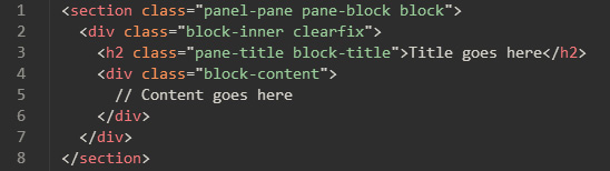
In the settings I can only set classes on the "section" tag. Which means the modular CSS had to account for this and kind of ruined the whole modular approach in a way. Because I had to account for every instance where we would not have direct access to every tag we wanted. This complicated things a lot but since we had simplification and reusable elements in mind when designing the website, I still managed to account for most of these cases pretty nicely, but I would have loved more control over the HTML.
Building a modular front end for Drupal is no simple task and I often wonder if this is the best way to do it when it comes to Drupal.
Conclusion
Overall this was a very exciting project from which I learned a great deal about users, Drupal and working with the same team for years. Our preliminary results, based on our open beta, indicate good things, although there are a lot of things yet to be fine tuned and tested.