Nostalgic wanted to transform this experience by vetting the tours it would offer personally and guaranteeing the quality would meet expectations. With very limited selection and proper details about each destination included in the tour along with beautiful photography of the place.
The greeting
To give a proper feel for the country and a smooth transition from the intro into the rest of the landing page is this amazing photo by Anders Jildén
Tour intro
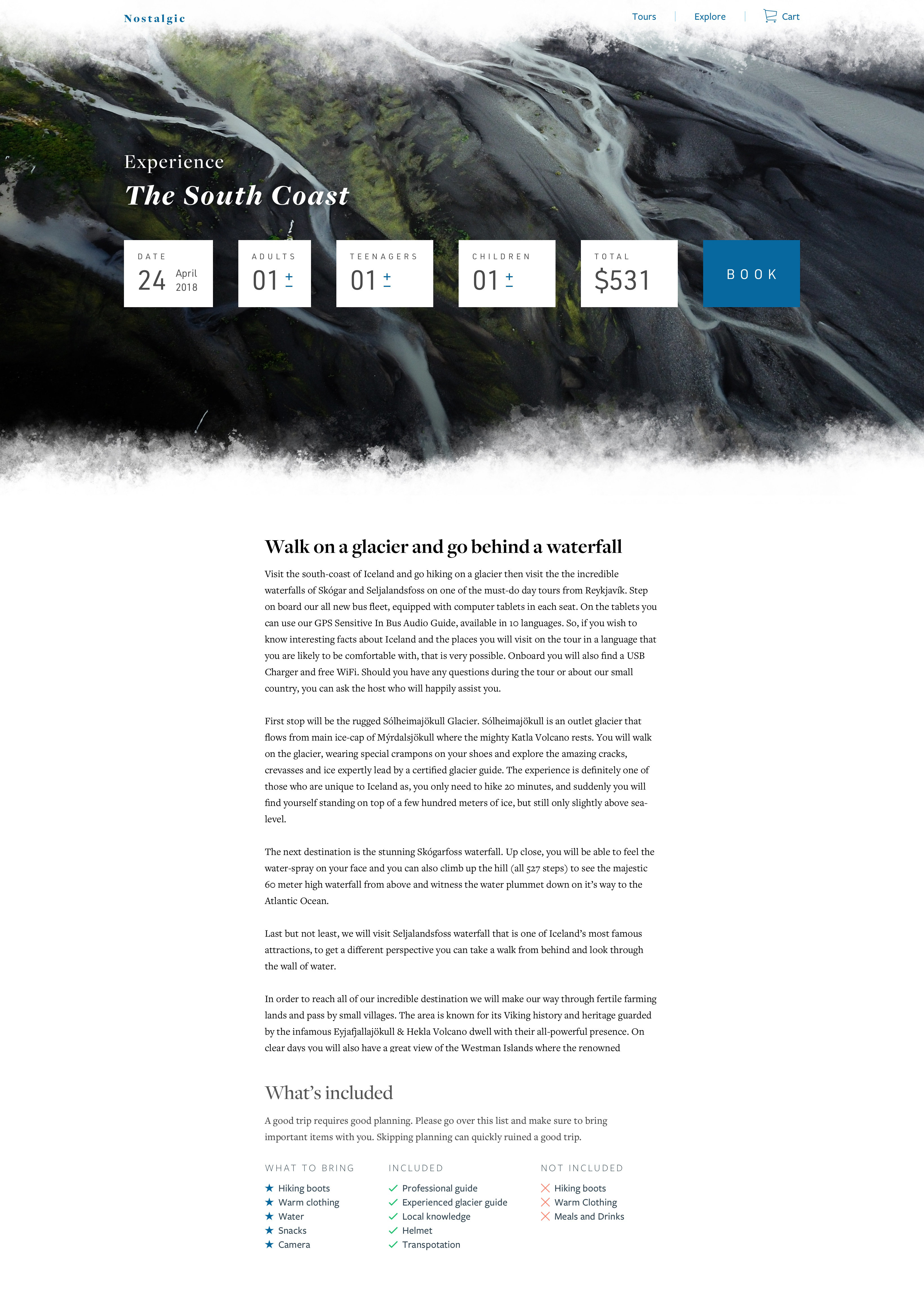
Since the tours were very limited, we wanted each to be as impactful as possible right from the start. That's how we came up with this image on top of image layout which would make you feel the tour already. In the case of The South Coast tour, where you visit glaciers, waterfalls and dramatic black beaches. You see a large image in the background of a glacier texture with a serenic image on top of a black beach with a basalt rock formation overhanging a man looking out across the ocean. This sets the mood for what you will feel and experience on the tour.
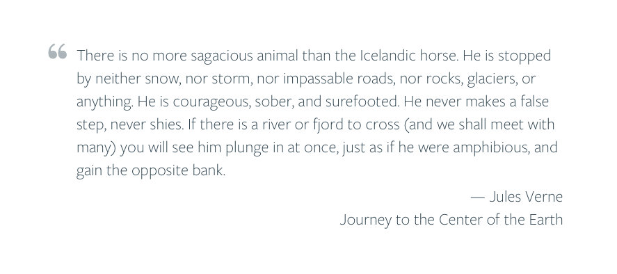
After each tour we break things up with a little quote about the place, my favourite quote being the one for the Snæfellsnes peninsula tour where the famous book of Jules Verne, The Journey to the center of the earth took place.
The Why
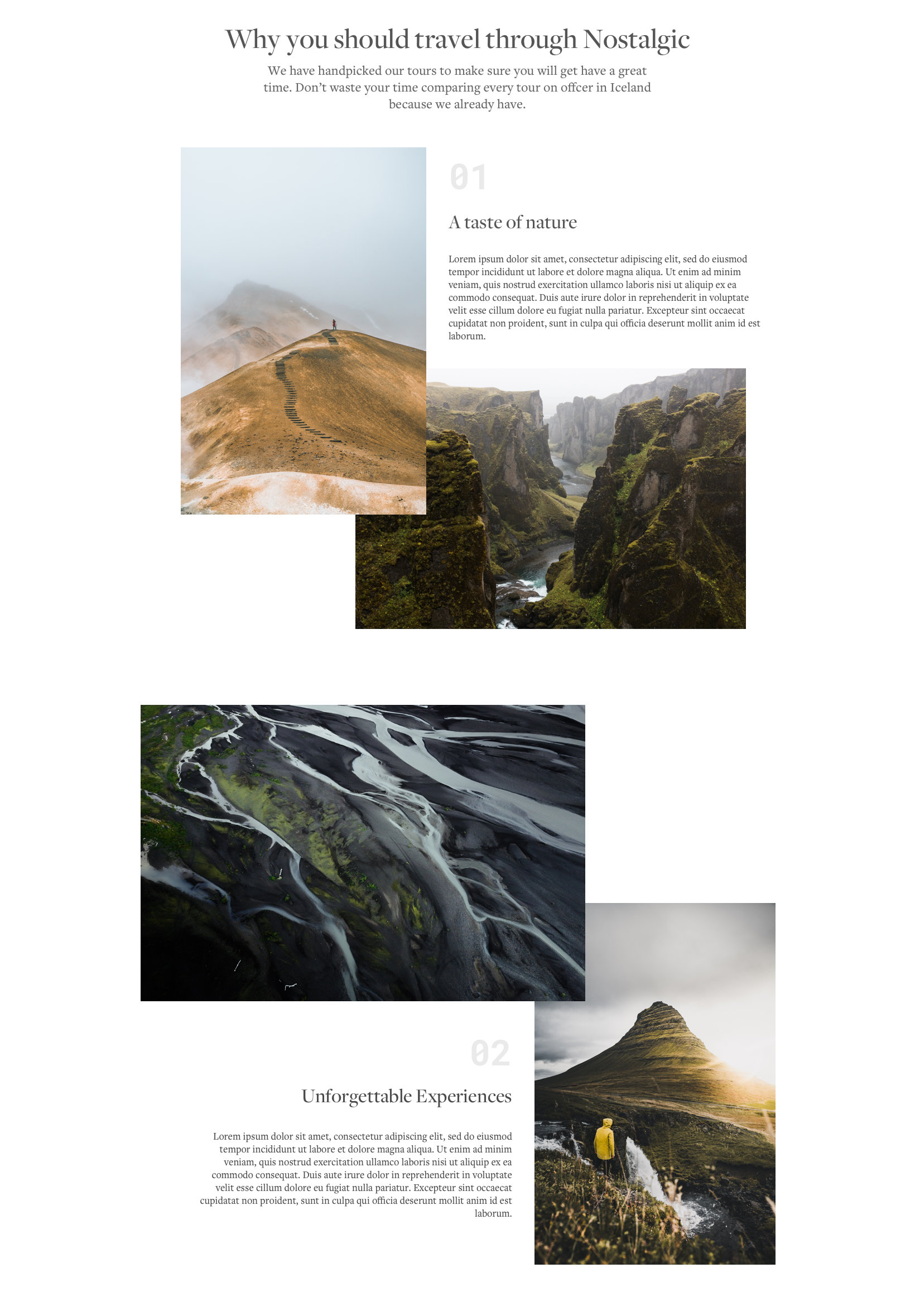
Since Nostalgic wasn't supposed to be like all the other traditional booking websites in Iceland, we wanted to explain how we are different and why you should choose Nostalgic.
Photography
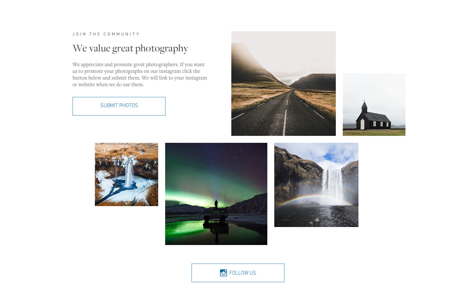
Because good photography was so important to setting the feel for the tours we wanted to build a community and encourage our travellers to share their images and experiences with us.
The tours
The most important pages are where you get all the details and reserve your spot. The reservation front and center in an impactful way. Followed by the main information about the tour.
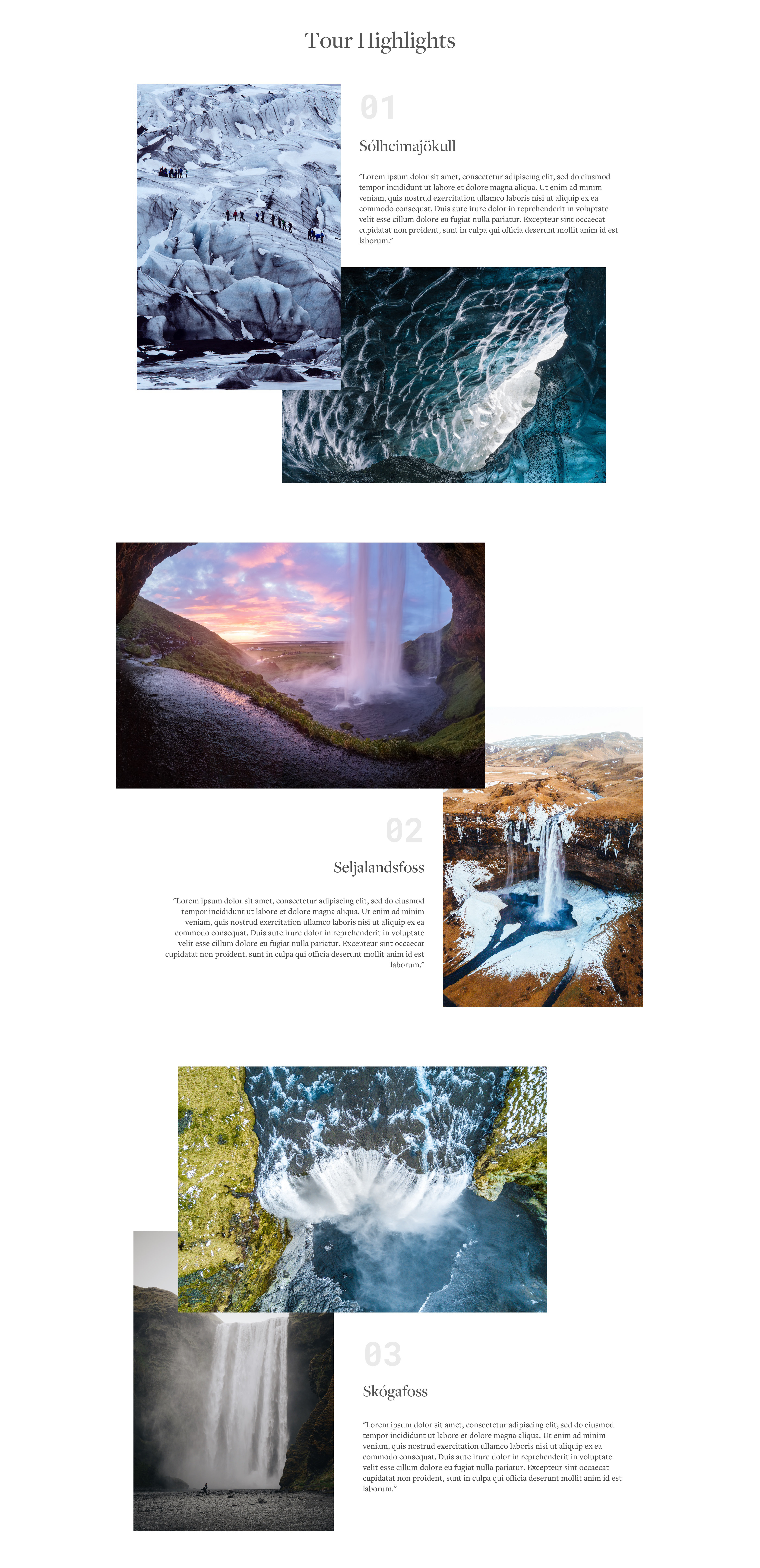
Highlights
In order to give people a proper feel for the tour and it's destination we created this collage of text and images labelled with the stop order.
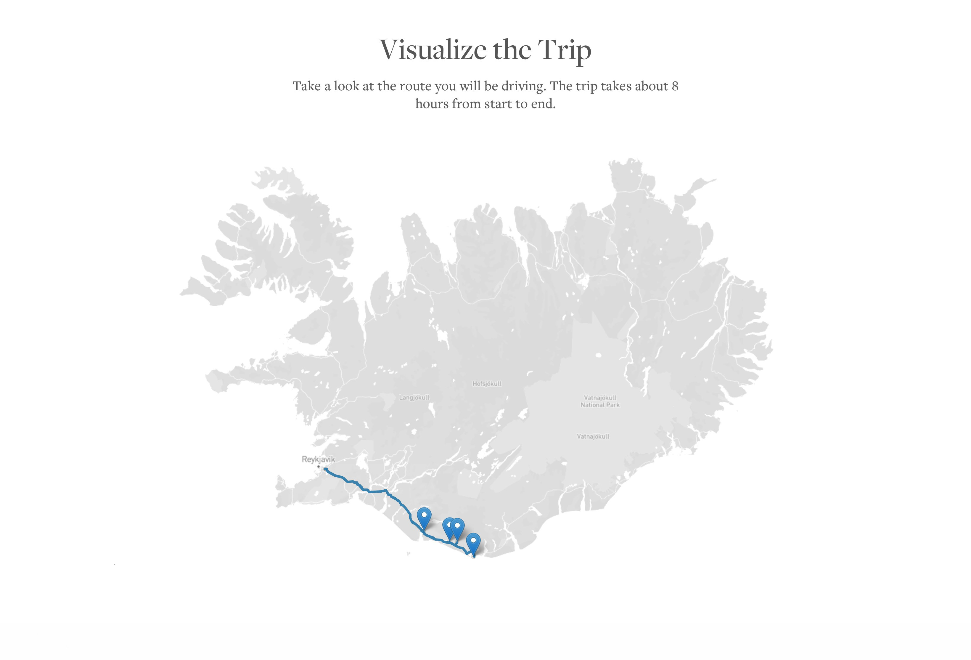
The map
An interactive map that blends perfectly into the page matching the brand and feel of the site. Zoom in to get as much detail as you want. The plan was to have special icons matching the destination type, like a waterfall, cave, and so on.
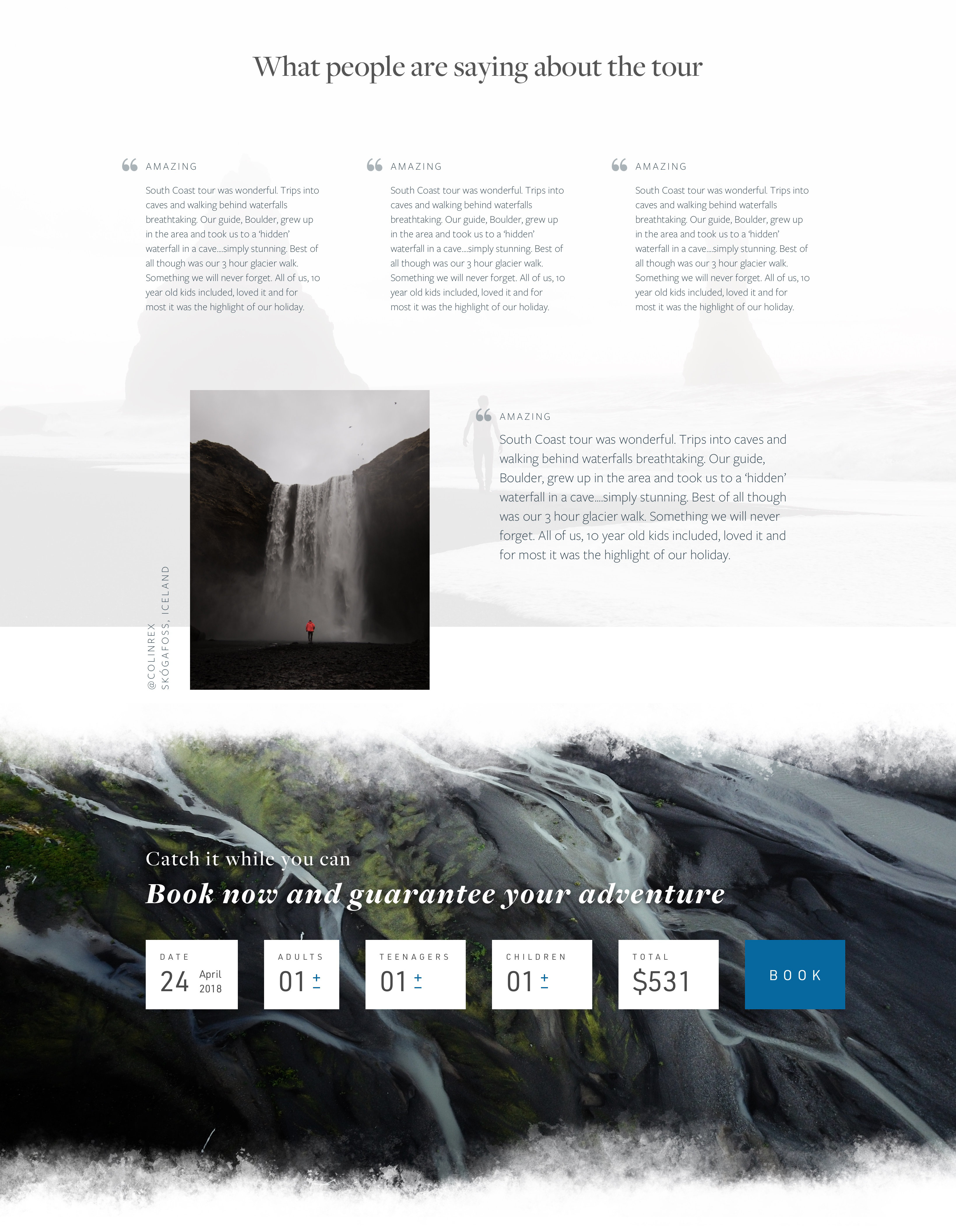
Testimonials
Happy customers is the end goal so displaying our pride was important to us. Right before the bottom booking widget we displayed our customers testimonials and some of their images from the trip along with proper credit of course.
The adventure ended before it began
Unfortunately not every project becomes a reality and sometimes it's better to move on rather than to force something to birth. This project was close to becoming a reality but ultimately did not quite make it there due to some critical factors falling through. Nevertheless I am proud of the ideas and design which is why I chose to display it on my site anyway. It was great working with the people involved in this project and I hope somebody gets inspired by the work produced.
Here are the two main pages in all their glory: