Currently responsive images work by checking the window width and giving you the corresponding image based on that width. Which is fine when you have an image that fills out the widest width possible, like those big hero images, but that's not always the case.
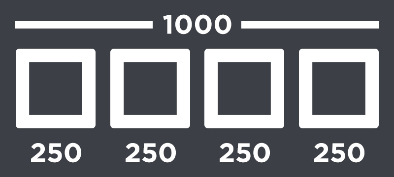
In my experience I often need a larger image when the window size is smaller. For example if you have four images side by side across the screen, it would look something like this:
But as you reduce the screen size the images might get to small to be side by side like that. So you decide to change the layout of them to 2x2, like this:
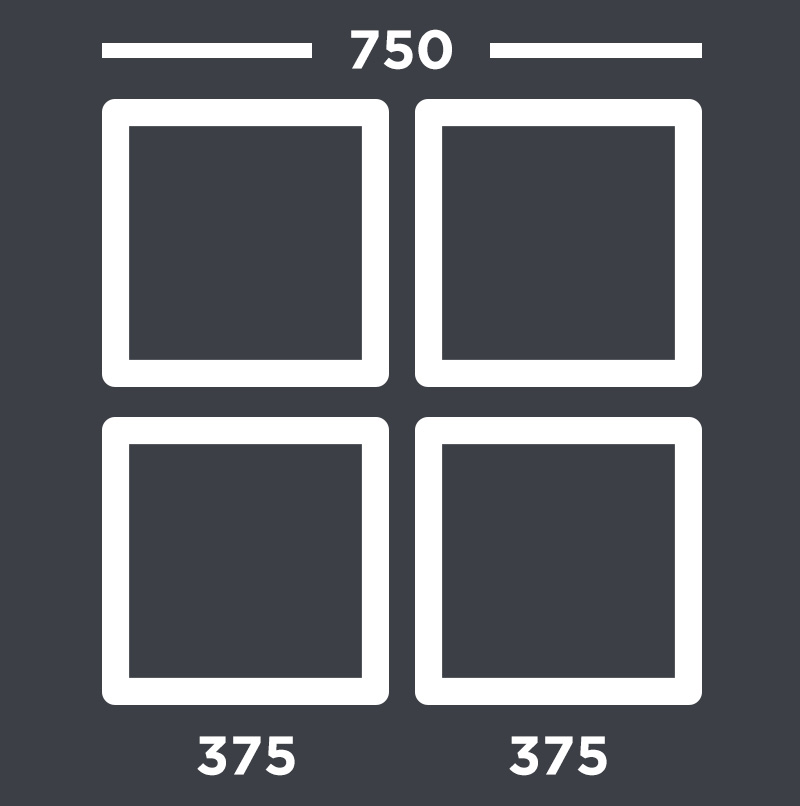
Notice how the images are actually a quite bigger than they were in the beginning.
My idea on how to improve it
I think it would be optimal if the browser would simply check the size of the image container (the tag wrapped around the image). If the image container is small then get a small image. If the image container is big then get a big image. All you had to do would be to supply the different image sizes and make the browser aware of where to get them.
This would make it trivial to add images anywhere without having to think about how the window size will affect the image, whether it will get bigger or smaller, for each and every one. And also if you suddenly decide to change the layout, you don't have to specify the sizes of the images all over again.
After all, images account for sixty two percent of the data we send over to the clients and I just want to send the smallest possible amount of data whenever I can, no matter if the client is using a desktop, tablet or mobile.
However the problem with my solution is that we can't exactly expect the browsers to delay choosing the images until the HTML, CSS and Javascript has all finished loading can we? We could possibly though load the smallest one by default and then lazyload the rest.